Colour Analysis: A Guide For Summers
Posted by Victoria Lochhead on
Have you recently had a colour analysis and been told you suit the summer palette? Perhaps you knew all along those were your best colours, or maybe it's come as a complete surprise, perhaps even a bit overwhelming? In this months blog, we will explore the summer palette and help you make the most out of your beautiful summer colouring.

Colour analysis: A brief introduction
Let’s start from the beginning incase you are not familiar with colour analysis or you haven’t had a consultation yourself yet. Colour analysis is when a trained colour stylist works with you to find a palette of colours that complements the natural colouring you have in your skin, hair and eyes. When we wear colour that is in harmony with our own naturally occurring colours, the overall look is more cohesive, and the colour enhances the best of our colouring rather than fighting against it. If you’ve ever tried on a colour in a changing room and instantly felt washed out, then you’ll know what it means to have a colour fight against you. The best colours for you to wear are based on finding harmonious tones that complement and enhance your natural colouring.
In seasonal colour analysis, we do this by using a base of four possible colour palettes that are named after the four seasons. Each palette has different tonal properties that are designed to work beautifully together, meaning they are great foundations on which to build your wardrobe, and your outfits. In this blog, we’re looking at just one of the four palettes: the Summer.
Understanding the Summer Palette
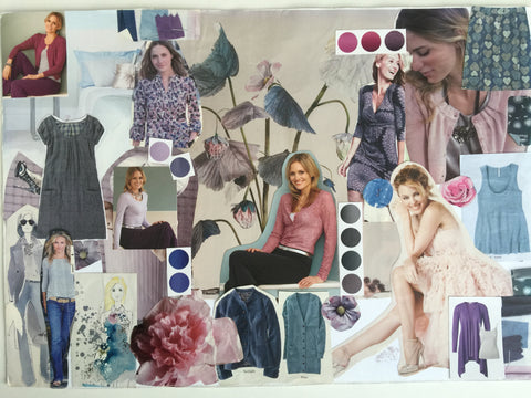
If you’ve had a colour consultation and been told you are a summer, then we can assume that your natural colouring has an element of coolness rather than warmth, that you suit lighter colours rather than deep and that there may be something about the intensity of a colour that means that softer or low contrast colours suit you better than bright, intense or high contrast colours. Your summer palette might look something like this:

Understated elegance: Key Elements in Your Wardrobe
When it comes to your wardrobe, think about using your clothes to create blended, harmonious and elegant outfits. You can use your soft summer colours in harmony with your neutrals to create a stunning blended look. Your neutral colours include, grey, navy, silvers and soft whites. Use soft natural fabrics to help absorb colour and think about interesting details rather than sharp or bold patterns and prints.
In your colour analysis session, your stylist should have shown you which colours are your neutrals and how to wear them with your other colours, but they may also have shown you your very best colours - those absolute wow combinations that really enhance your eye colour and make an incredible first impression. There may also be a few colours in the palette that don't work so well for you and your stylist may have explained these or given you an outfit percentage of how much you should use in an outfit or print.
Make-up Colours: Enhancing Your Natural Beauty
Your makeup colours should complement your summer colouring. Here are a few suggestions:
- Eyeshadow: Mid/Light Blues, Greys & Mauves. Pale Pink, Taupe & Silver
- Eyeliner: Soft Blue, Smoke, Grey
- Blusher: Pale & Rose Pinks
- Lipsticks: Pale Pinks, Pinky Reds, Rosy Shades & Light Plum
- Avoid orange toned make up or anything too yellow or beige

Use a Pink toned lipstick or gloss, like this one in Velvet Kiss from Tropic.
Hair Colour and Jewellery to Complement Your Summer Palette
Your hair colour and jewellery can also play a huge role in enhancing your Summer palette. For hair colour, you might have cool ash tones in your hair as either an ashy blonde or a cool ash brown. Or you might have a wonderful natural grey hair colour which works so well with the summer palette. If you are a rarer dark summer with brown hair, keep to your natural colouring and don't be tempted to add any red or auburn tones to your hair.
Your jewellery preference is likely to be neat simple styles that compliment your outfit, and you can choose from metals such as silver, platinum, rose gold, pewter, white gold, or perhaps soft pink pearls or shells (like Mother of Pearl).
Getting started with your colour palette
Once you’ve had a colour analysis it can sometimes be easy to feel very excited and overdose on the colours, only to find it’s then hard to put them together. Start by seeing what you already own in the wardrobe in your colours and experiment with how you can combine those to make an outfit. As you come to replace things, build your neutral items and then add a smattering of your best colours either as scarves or a top and go from there. It’s also a good idea to start looking for brands that really embrace the summer palette: take a look at White Stuff, Mint Velvet, and Poetry to get started. Even if you’re like us and prefer to buy clothes preloved, being able to search by some of your best brands is a great way to find preloved bargains online.

This Phase Eight Dress is in Summer Colours
Style overlay
In colour analysis very often I find that there are commonalities beyond colour. Certain personality traits, home styling preferences, hobbies, activities and style preferences can be similar within a group of people who share the same colour palette.
With summers there are often two main styling preferences; one is to keep things very simple and understated, and the other is a style that is more romantic or feminine in look. Often summers prefer to keep things simple and opt for soft natural or expensive fabrics. Hair is often either simple and neat or loose and flowy and any accessories are good quality and understated.
Further Colour Inspiration and Resources
If you're in search of additional colour inspiration and resources, check out https://www.kettlewellcolours.co.uk/find-your-colours/colour-combinations
where you can use their colour inspiration page for combination ideas.
We also organise preloved clothing on our website by colour season, so you can get a feel for the clothes we’d consider “summer friendly” here: https://frankieandruby.co.uk/collections/summer
For more tips on how to get started with your palette to create outfits, check out our blog post at:
Next Steps: Making the Most Out of Your Summer Palette
If you're interested in diving deeper into your colour analysis, consider these next steps:
- Register your interest for our newest online course - your colour deep dive - a four week programme working one on one with you to understand your colour palette and how to individualise it to you and your dominant colour traits, your style preferences and even your personality type!
- Join us in Sustainable Style Studio. In this 12 week online course, you’ll discover the treasures already in your wardrobe, how to edit and create outfits, how to dress to suit your body shape, and how to use your palette. We also cover why some outfits work and some don’t using our gin and tonic method and I’ll show you how to shop sustainably and keep the flame alive. You can join online here: https://frankieandruby.co.uk/products/sustainable-style-studio-online-course
- Contact me for an online makeup report of clickable products recommended to suit your natural colouring or for help with finding perfect things for you in a preloved online shopping mood board.
For more details on these offerings, email victoria@frankieandruby.co.uk.
Wrapping Up
Understanding your summer palette can be a game-changer in enhancing your personal style and confidence. We hope this guide has provided you with a solid foundation, and we're always here to answer any questions you may have. Feel free to reach out at victoria@frankieandruby.co.uk
Thank you for reading, and if this guide has been helpful, we'd love to hear from you! Feel free to leave your comments below about your own colour analysis experience.