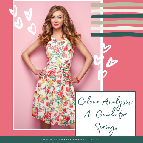
Colour Analysis - A Guide For Springs
Posted by Victoria Lochhead on
Have you recently had a colour analysis and been told you suit the spring palette? Perhaps you knew all along those were your best colours, or maybe it's come as a complete surprise, perhaps even a bit overwhelming? In the last of our blog series on colour seasonal palettes, we'll explore the spring palette and help you make the most out of your beautiful spring colouring.
Colour analysis: A brief introduction
Let’s start from the beginning incase you are not familiar with colour analysis or you haven’t had a consultation yourself yet. Colour analysis is when a trained colour stylist works with you to find a palette of colours that complements the natural colouring you have in your skin, hair and eyes. When we wear colour that is in harmony with our own naturally occurring colours, the overall look is more cohesive, and the colour enhances the best of our colouring rather than fighting against it. If you’ve ever tried on a colour in a changing room and instantly felt washed out, then you’ll know what it means to have a colour fight against you. The best colours for you to wear are based on finding harmonious tones that complement and enhance your natural colouring.
In seasonal colour analysis, we do this by using a base of four possible colour palettes that are named after the four seasons. Each palette has different tonal properties that are designed to work beautifully together, meaning they are great foundations on which to build your wardrobe, and your outfits. In this blog, we’re looking at just one of the four palettes: the Spring.
Understanding the Spring Palette
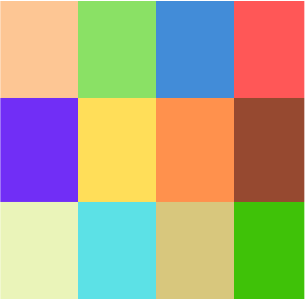
If you’ve had a colour consultation and been told you are a spring, then we can assume that your natural colouring has an element of warmth rather than coolness, that you suit lighter colours rather than deep and that there may be something about the intensity of a colour that means that brighter or clearer colours suit you better than muted or soft colours. Your spring palette might look something like this:
An Injection of Colour: Key Elements in Your Wardrobe
When it comes to your wardrobe, think about adding a splash of these fun and energetic colours to your outfit, especially around your face. You can use your bright spring colours in harmony with your neutrals to create a stunning warm confident look. Your neutral colours include light clear navy, tan and mid brown, beige and grey/ beige, and cream, soft white or ivory. If you are drawn to pattern or print, that is a good way of bringing in lots of colours and then you can pick out a neutral or a key colour to add as accents in shoes, jewellery and bags.
In your colour analysis session, your stylist should have shown you which colours are your neutrals and how to wear them with your other colours, but they may also have shown you your very best colours - those absolute wow combinations that really enhance your eye colour and make an incredible first impression. There may also be a few colours in the palette that don't work so well for you and your stylist may have explained these or given you an outfit percentage of how much you should use in an outfit or print.
Make-up Colours: Enhancing Your Natural Beauty
Your makeup colours should complement your spring colouring. Here are a few suggestions:
- Foundation - Warm tones with a hint of yellow (avoid pinky or too orange a tone)
- Eyeshadow - Warm & light browns, ivory, beige, gold, cream, and light/warm greens
- Eyeliner - Light Brown & Green
- Blusher - Apricots and peach shades
- Lipsticks - Corals, Warm Bright Red, Light Brown & Nudes
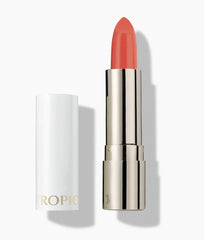
Use a Warm toned lipstick or gloss, like this one in Go Go Goji from Tropic.
Hair Colour and Jewellery to Complement Your Spring Palette
Your hair colour and jewellery can also play a huge role in enhancing your spring palette. For hair colour, you might have warm golden or reddish tones naturally in your hair, or have had them as a small child. If you want to dye your hair, consider colours like flaxen or golden blonde, light golden brown, or honey blonde - think warm beach blonde or coppery reds.
Your jewellery preference is likely to be fun, artisan or interesting pieces and the colours that go well with your spring palette include gold, brass, copper, coral, jade, and creamy pearls.
Getting started with your colour palette
Once you’ve had a colour analysis it can sometimes be easy to feel very excited and overdose on the colours, only to find it’s then hard to put them together. Start by seeing what you already own in the wardrobe in your colours and experiment with how you can combine those to make an outfit. As you come to replace things, build your neutral items and then add a smattering of your best colours either as scarves or a top and go from there. It’s also a good idea to start looking for brands that really embrace the spring palette: take a look at Boden, Me+em, and Aspiga to get started. Even if you’re like us and prefer to buy clothes preloved, being able to search by some of your best brands is a great way to find preloved bargains online.
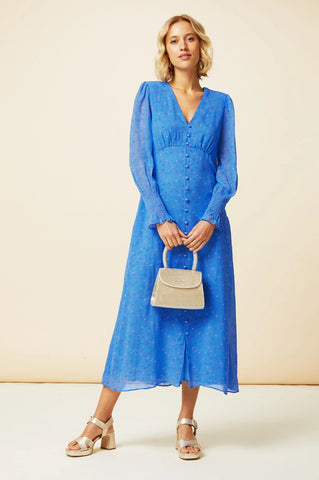
This Aspiga Dress is in Spring Colours
Style overlay
In colour analysis very often I find that there are commonalities beyond colour. Certain personality traits, home styling preferences, hobbies, activities and style preferences can be similar within a group of people who share the same colour palette.
When someone comes to see me and I don't yet know their palette, I can often spot a potential spring because they exude warmth and openness through their personality. And springs often love to chat and will talk openly, confidently and intelligently to people they come into contact with. In terms of styling with many springs I find that there is a definite preference for using pops of colour in an outfit; and often in unexpected ways such as a bright belt or a stripe on the side of a pair of trousers. Springs can often wear lots of colour and they carry it off beautifully.
Further Colour Inspiration and Resources
If you're in search of additional colour inspiration and resources, check out https://www.kettlewellcolours.co.uk/find-your-colours/colour-combinations
where you can use their colour inspiration page for combination ideas.
We also organise preloved clothing on our website by colour season, so you can get a feel for the clothes we’d consider “spring friendly” here: https://frankieandruby.co.uk/collections/spring
For more tips on how to get started with your palette to create outfits, check out our blog post at:
Next Steps: Making the Most Out of Your Spring Palette
If you're interested in diving deeper into your colour analysis, consider these next steps:
- Register your interest for our newest online course - your colour deep dive - a four week programme working one on one with you to understand your colour palette and how to individualise it to you and your dominant colour traits, your style preferences and even your personality type!
- Join us in Sustainable Style Studio. In this 12 week online course, you’ll discover the treasures already in your wardrobe, how to edit and create outfits, how to dress to suit your body shape, and how to use your palette. We also cover why some outfits work and some don’t using our gin and tonic method and I’ll show you how to shop sustainably and keep the flame alive. You can join online here: https://frankieandruby.co.uk/products/sustainable-style-studio-online-course
- Contact me for an online makeup report of clickable products recommended to suit your natural colouring or for help with finding perfect things for you in a preloved online shopping mood board.
For more details on these offerings, email victoria@frankieandruby.co.uk.
Wrapping Up
Understanding your spring palette can be a game-changer in enhancing your personal style and confidence. We hope this guide has provided you with a solid foundation, and we're always here to answer any questions you may have. Feel free to reach out at victoria@frankieandruby.co.uk
Thank you for reading, and if this guide has been helpful, we'd love to hear from you! Feel free to leave your comments below about your own colour analysis experience.